︎︎︎
typeface design
TYPOGRAPHY + TYPEFACE DESIGN
2-3 WEEKS/TYPEFACE
Overview:
We were tasked with two type design assignments. The creation of a pixel typeface, and a revival typeface of one of the first ever printed typefaces of our choosing (mine was Baskerville).
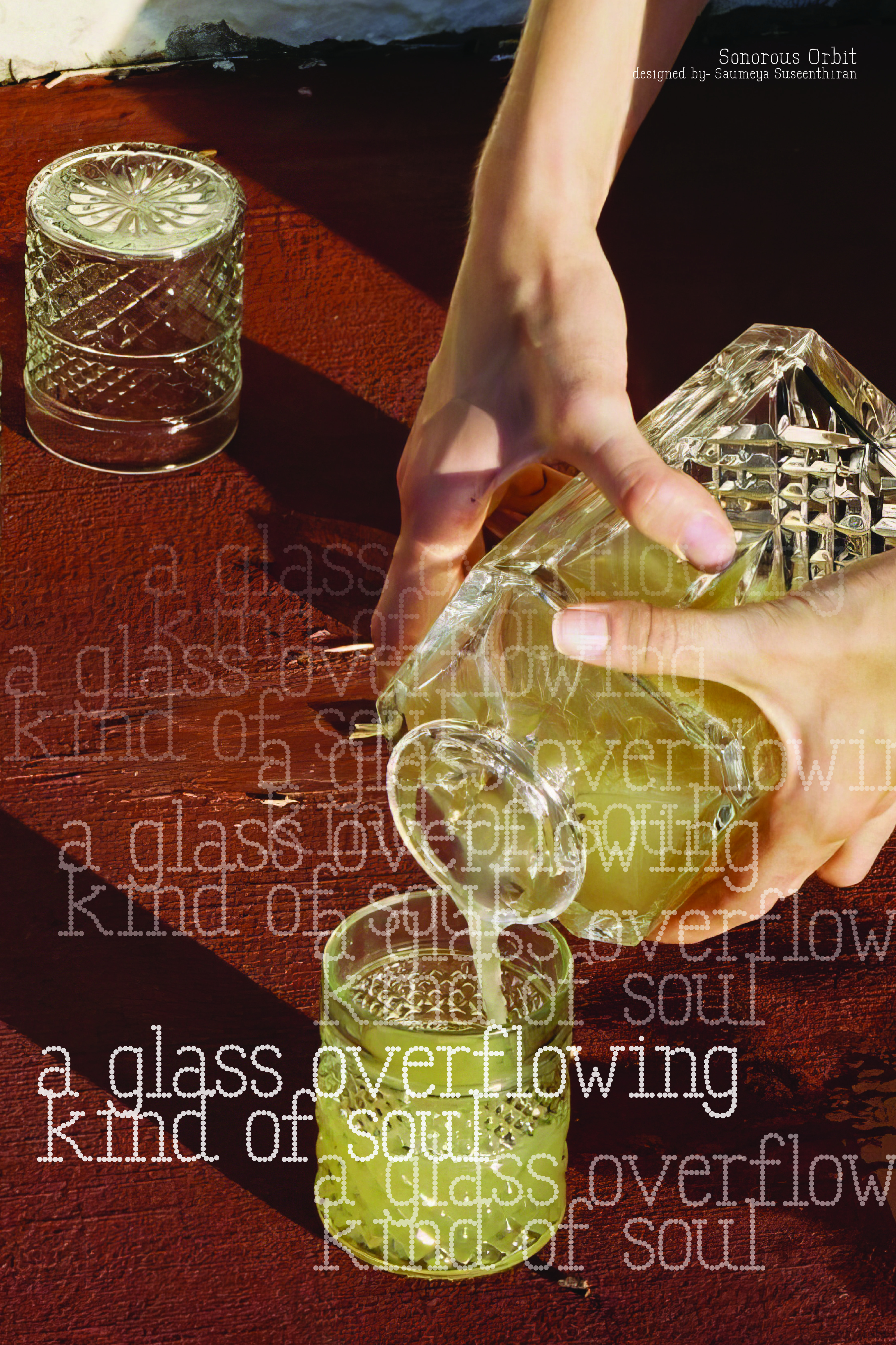
I chose to make a bubbly airy pixel typeface called Sonorous Orbit. This typeface took around 3 weeks to come to furition and was a great way to understand the Glyphs program and how typefaces are made with regard to proportion and aesthestics as a set.
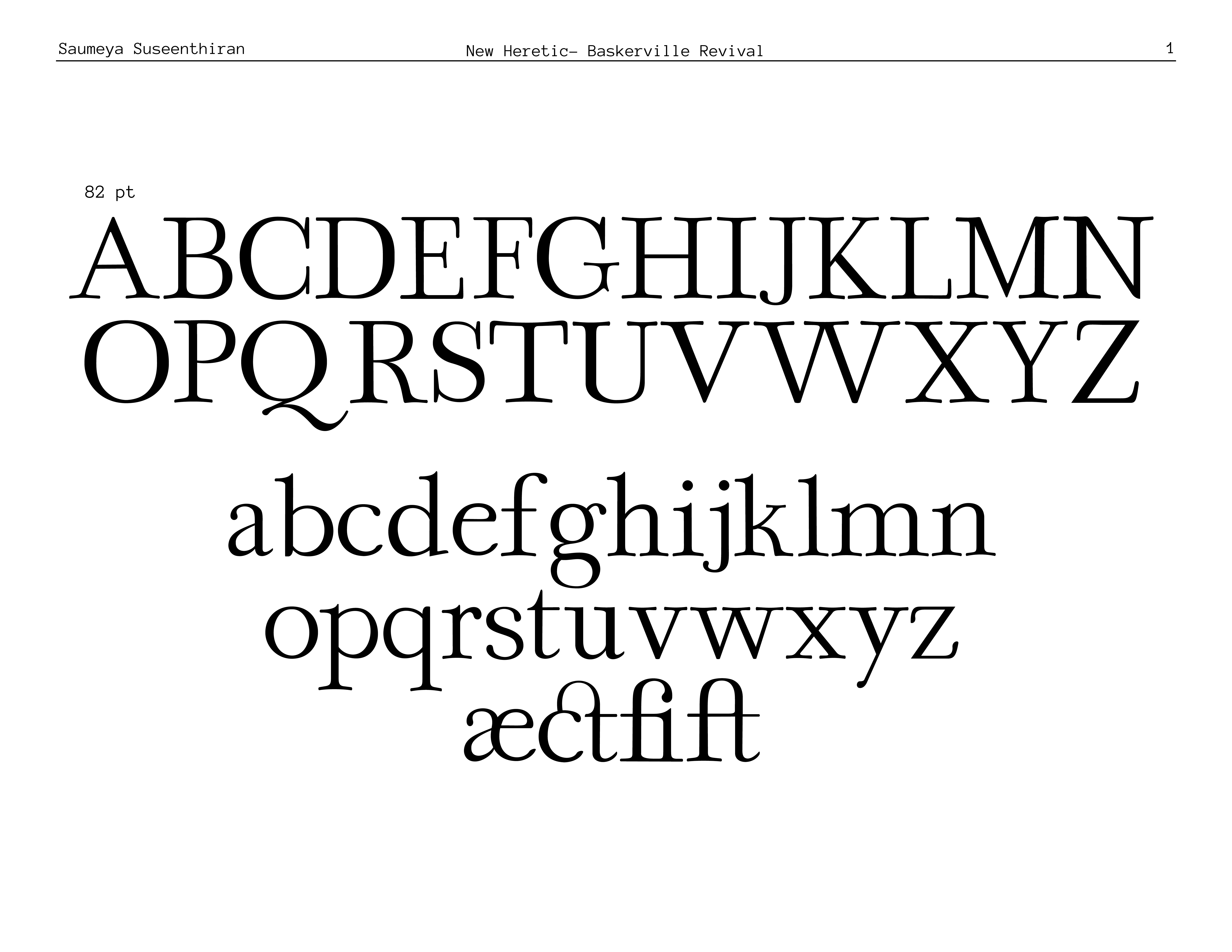
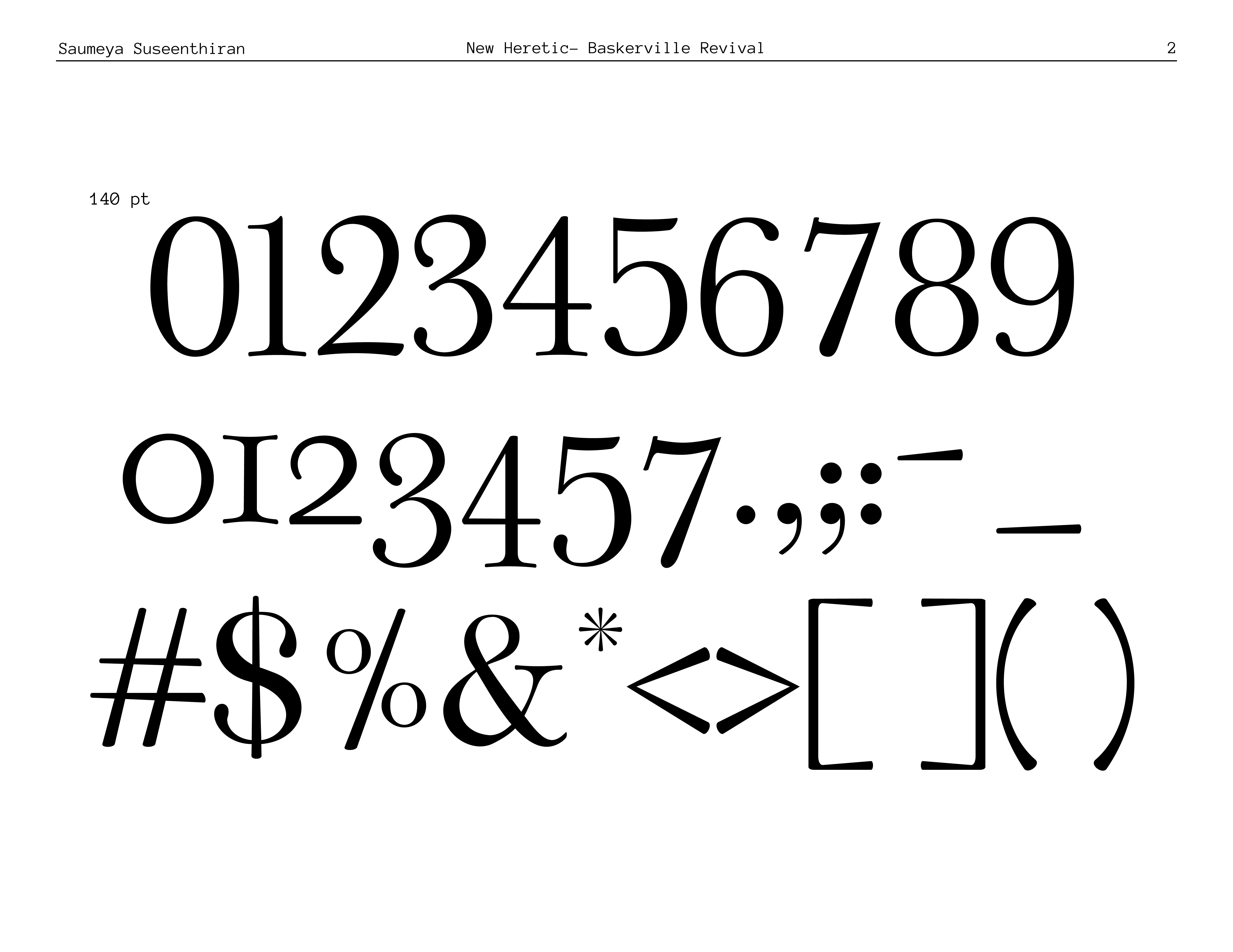
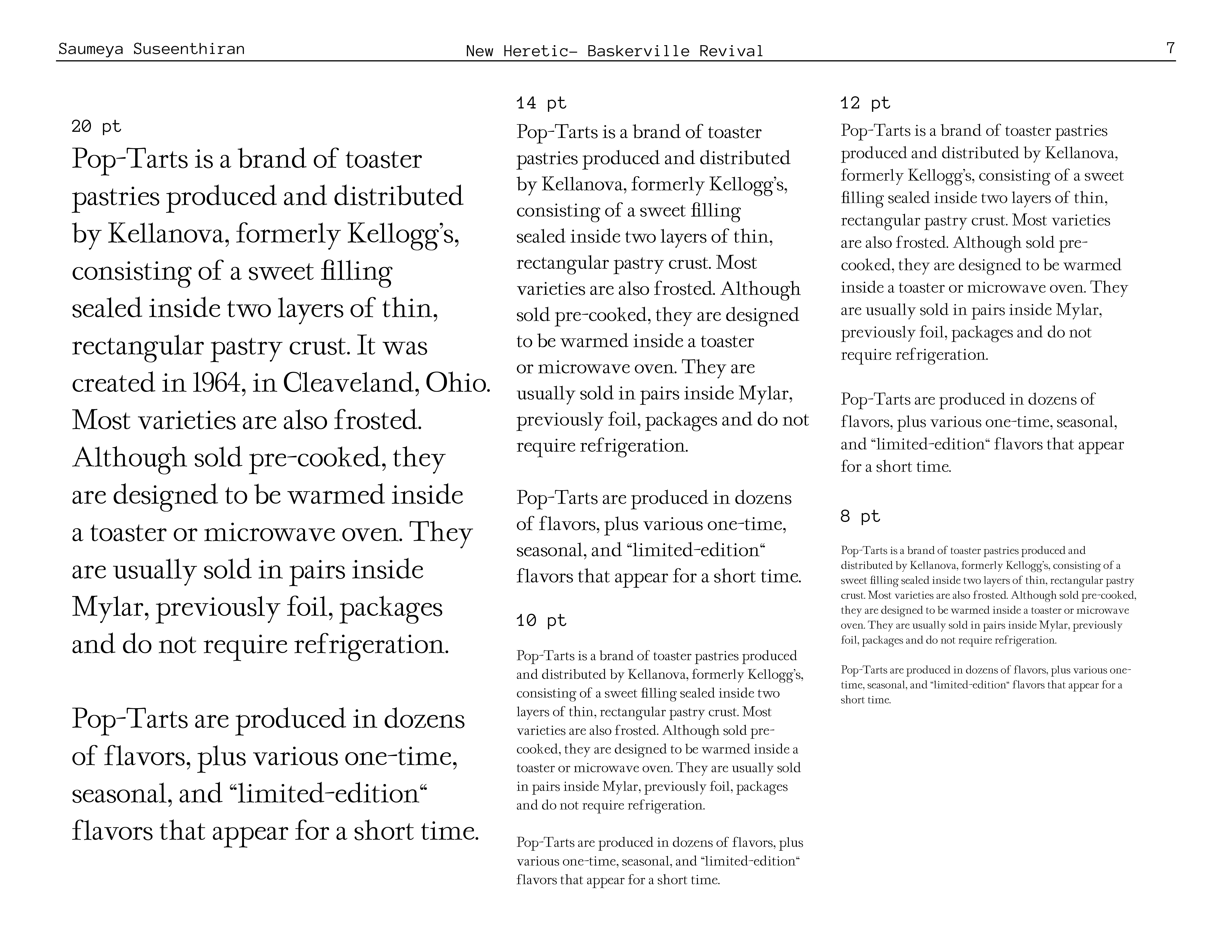
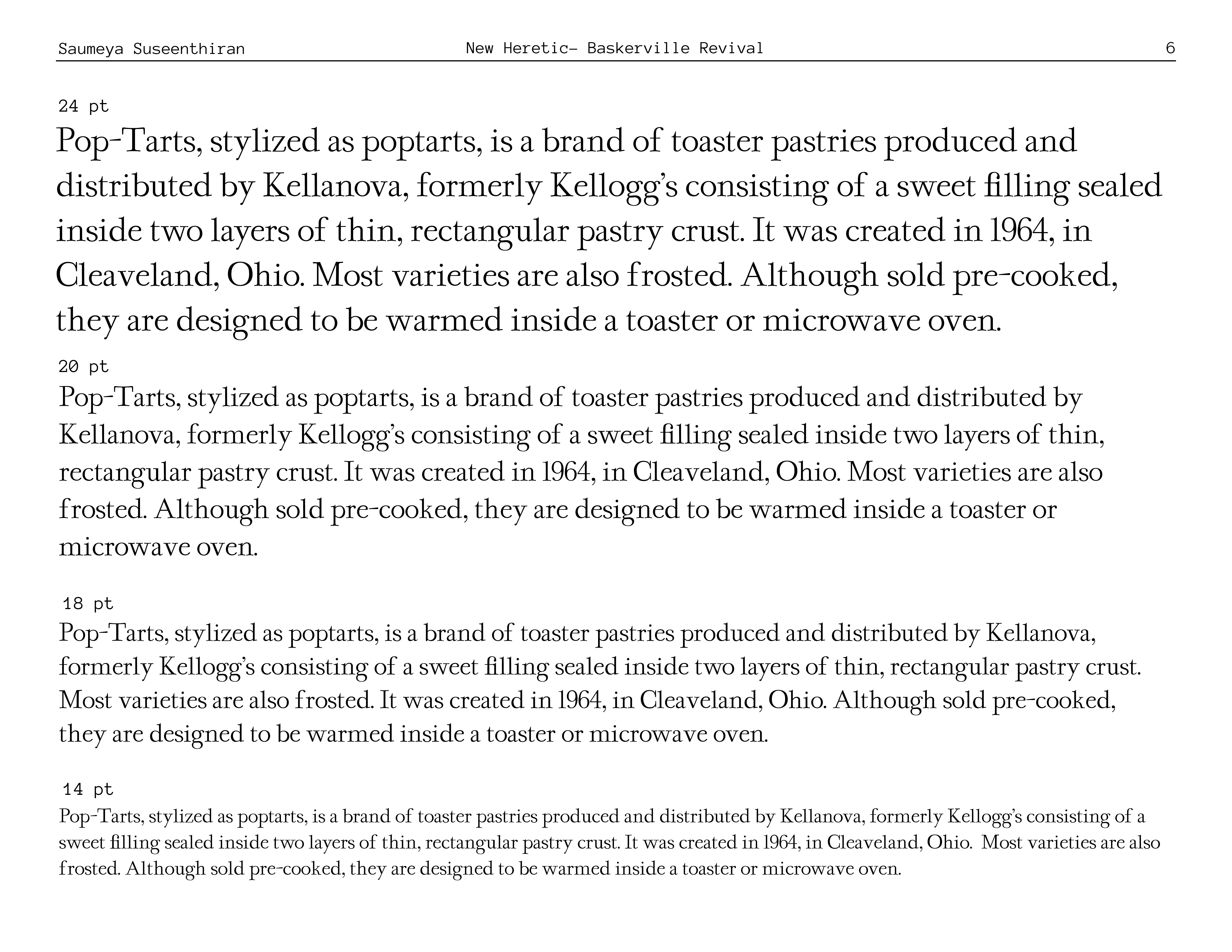
My Baskerville Revival, entitled New Heretic, an homage to John Baskerville’s herestic past in his printing of the Bible, took a much longer stretch of time in the adaptation and personalization of what would be our own spin on the current font.

Sonorous Orbit:
New Heretic:

proof below︎︎︎