︎︎︎
︎2023 Tech Equality Summit
SALESFORCE + BRANDING + IDENTITIES
(Figma, Adobe Illustrator) | 3 WEEKS
Overview:
I was assigned by Futureforce, Salesforce’s intern organization to design a general identity logo & assets for various promotions to feature at the 2023 Tech Equality Summit, an event dedicated for the next round of software engineering interns from underrepresented communities. The event allows them to network, celebrate this major accomplishment, and learn more about the company. I came up with two conceptual directions & through a series of feedback from my head designers and the client, I was able to land on a branding identity for the event that lends itself to the idea of a summit and expanding on new horizons, a sunrise mountain range theme.
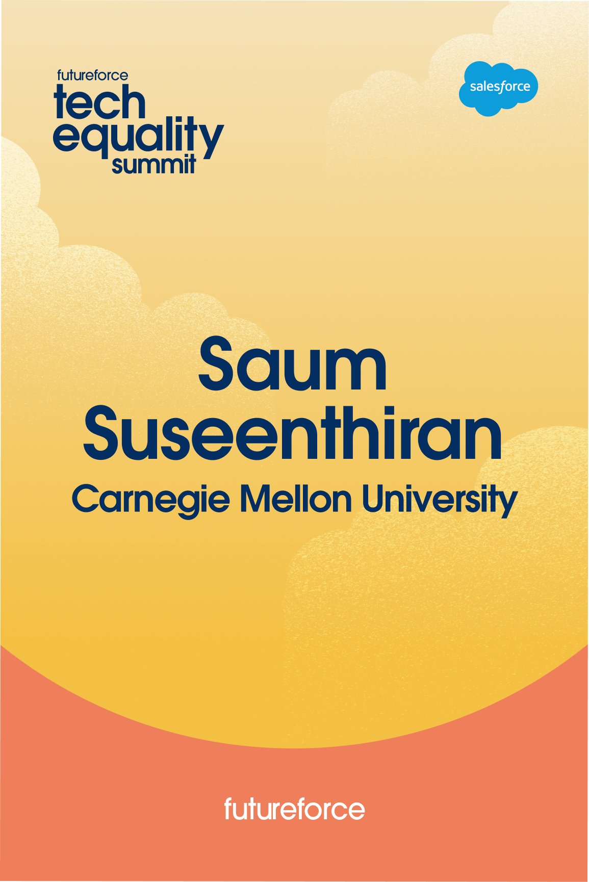
Deliverables:
︎ logo/identity
︎welcome card
︎name tags
︎digital signage
︎print easle signage
︎notebook
︎step and repeat, photo backdrop
︎‘follow the leader’ paddle
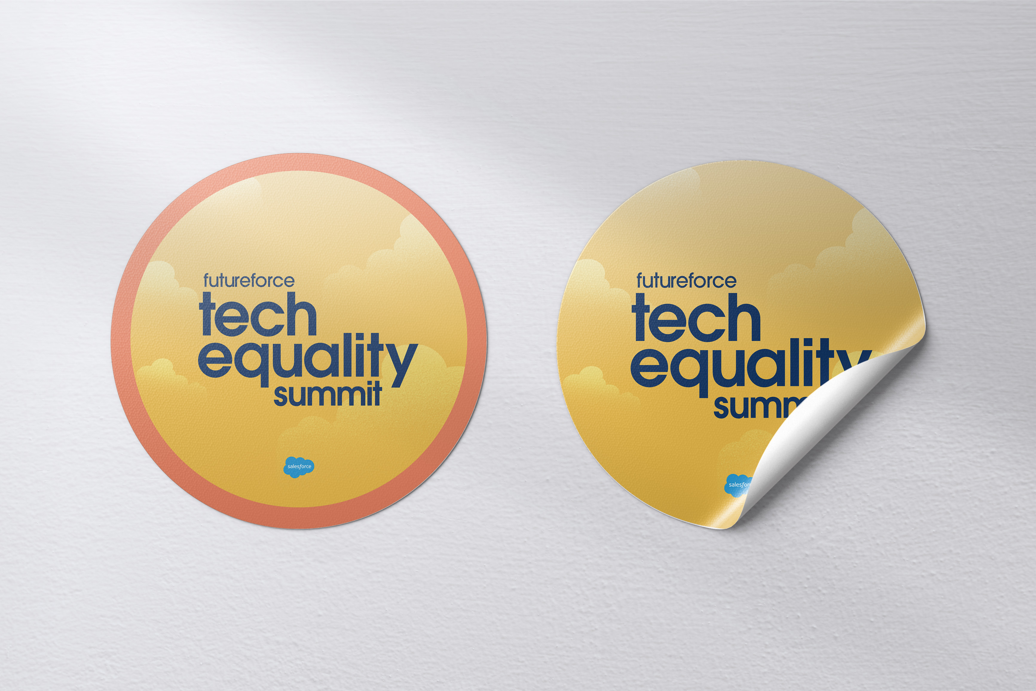
︎stickers
Identity/Logo:
For the identity I chose to go more simplistic based on client feedback, using the Salesforce navy blue and just creating a straightforward tiered look. For the identity I chose to go more simplistic based on client feedback, using the Salesforce navy blue and just creating a straightforward tiered look.
Style Guide:
These are the colors and fonts I ended up going with as well as the visual assets used in most deliverables.

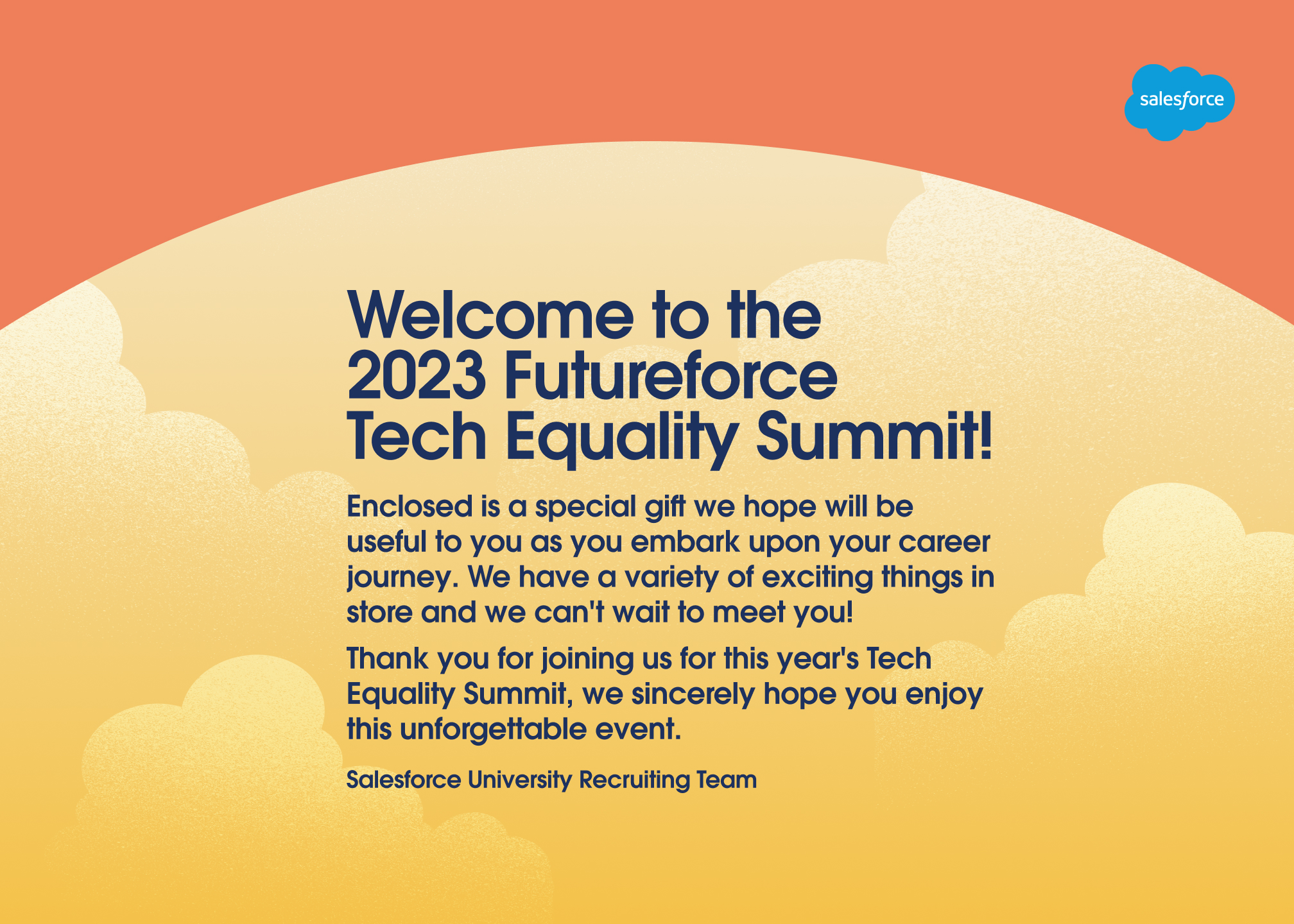
Welcome Card/Digital Signage:
The welcome card was the deliverable I started with and worked off of to develop the branding identity. The sunset mountain theme (the chosen direction of my two conceptual ideas) stemmed from the idea of a “summit” and the visual assets, beautiful Salesforce illustrations, felt like it would fit orange and yellows. After many color studies I felt like I found the right balance and contrast with the visuals and the navy identity. Then I carried this theme out in the other deliverables!
![Digital Signage]()
Name Tag, Stickers and Leader Paddle:
*stickers not used for event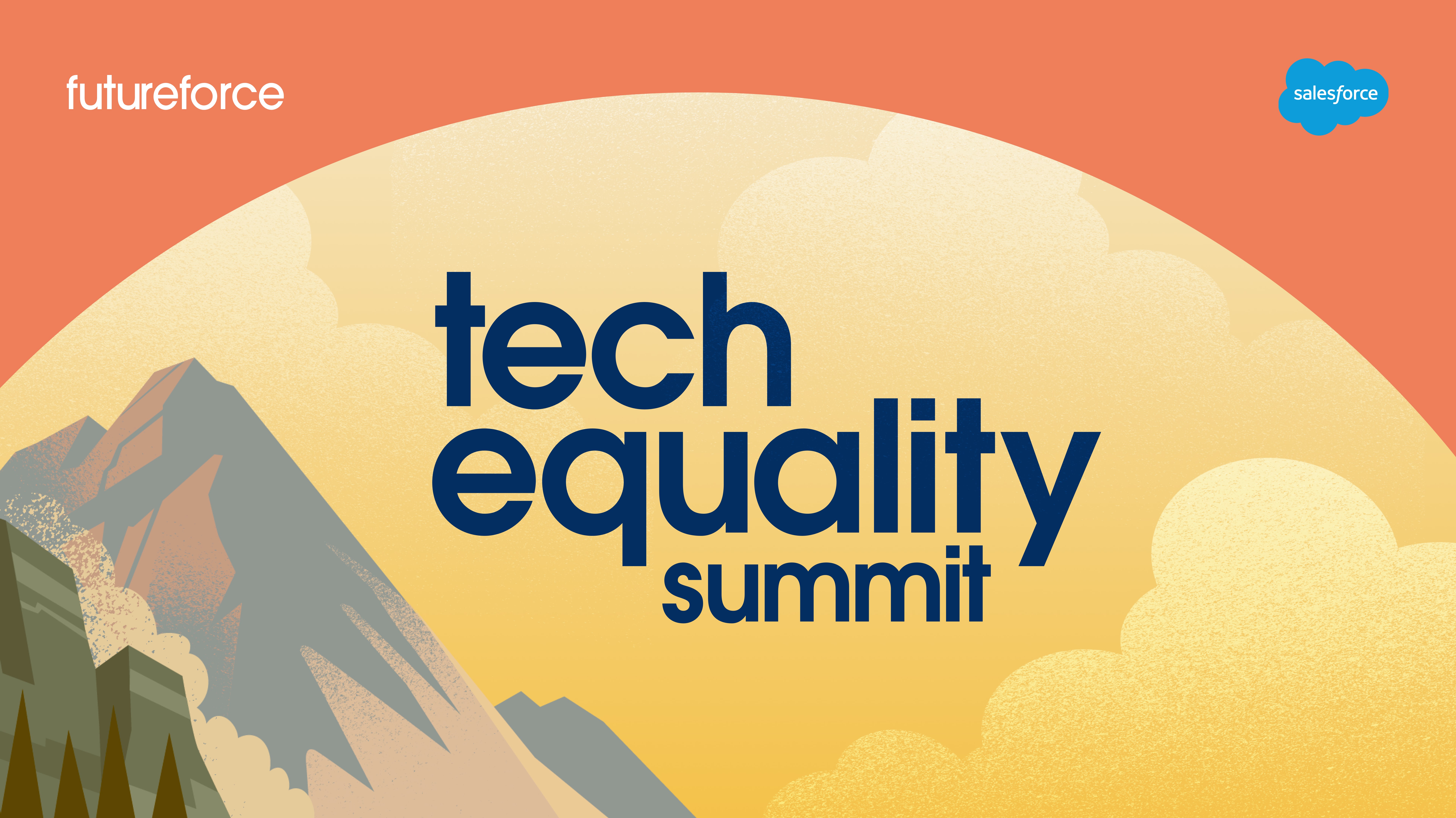


Notebook:
*eventually not used for event
Easle Signage:

Photo Backdrop:


Early Iterations and Process:
For my first conceptual ideas and original ideation process I had an idea that surrounded butterflies and growth, as well as the summit idea, all sticking to classic Salesforce colors. There were originally light and dark themes. My manager and creative directors gave me the insight to show the client concept 1 and concept 2 but with a different color scheme that contrasts more with concept 1. I did color studies that ended in the theme above, and the clients chose it as their favorite direction!